一个等比盒子容器Vue组件。
有个需求需要有个固定宽高比的盒子
可以使用padding-top的百分比值和绝对定位position: absolute来进行编写。
在CSS中:
margin-leftmargin-rightmargin-topmargin-bottompadding-leftpadding-rightpadding-toppadding-bottom
这8个值的百分比都是按照父元素的宽度进行计算的。
所以我们可以根据这个特性编写出一个简单的DEMO
HTML如下:
1
2
3
| <div class="parent">
<div class="child"></div>
</div>
|
CSS如下:
1
2
3
4
5
6
7
8
9
| .parent {
width: 50%;
margin: 0 auto;
}
.child {
padding-top: 50%;
background-color: pink;
}
|
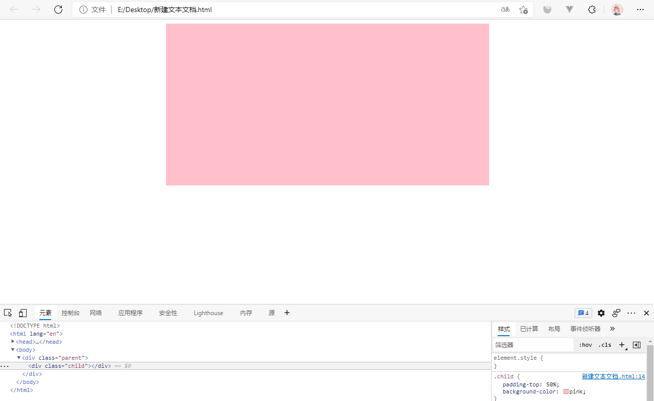
效果如下:
![]()
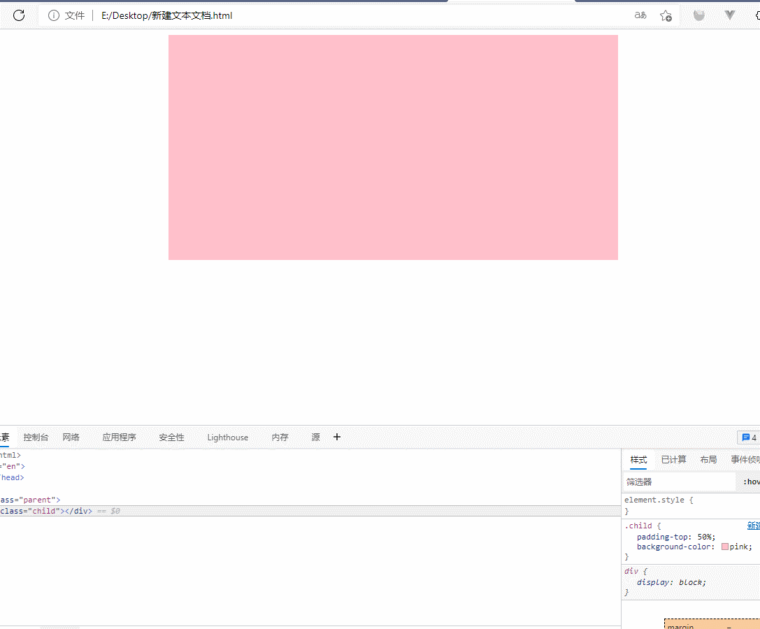
动态图如下:
![]()
可以看到整个盒子的宽高都是保持一定的比例的。
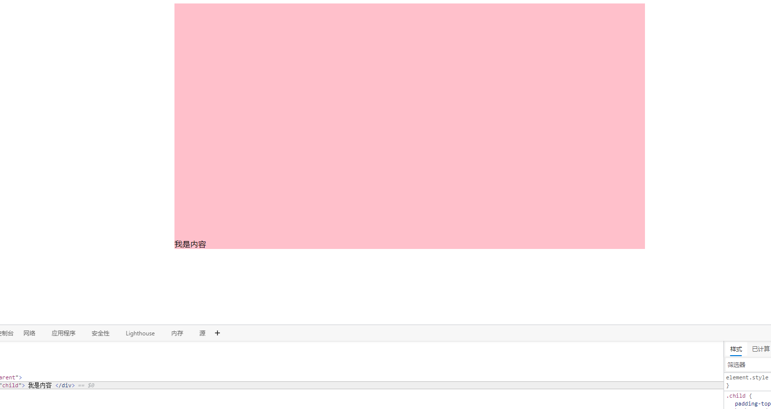
这时如果我们在child里面直接写的话是不行的。如下:
![]()
我们发现内容放在了盒子底部,因为padding-top占用的区域为padding,只有content区才能放置我们的内容。
所以这时候就要使用我们的绝对定位,通过新增一个内部盒子来把content区扩展到父元素的padding区。
HTML如下:
1
2
3
4
5
| <div class="parent">
<div class="child">
<div class="absolute"></div>
</div>
</div>
|
CSS如下:
1
2
3
4
5
6
7
8
9
10
11
12
13
14
15
16
17
18
19
| .parent {
width: 50%;
margin: 0 auto;
}
.child {
position: relative;
padding-top: 50%;
background-color: pink;
}
.absolute {
position: absolute;
top: 0;
bottom: 0;
left: 0;
right: 0;
background-color: black;
}
|
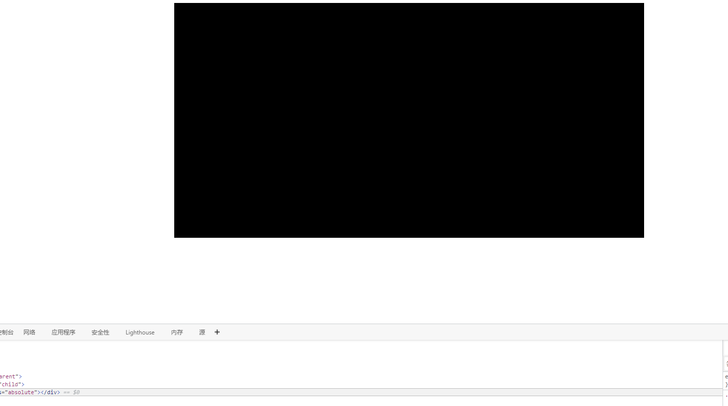
效果如下:
![]()
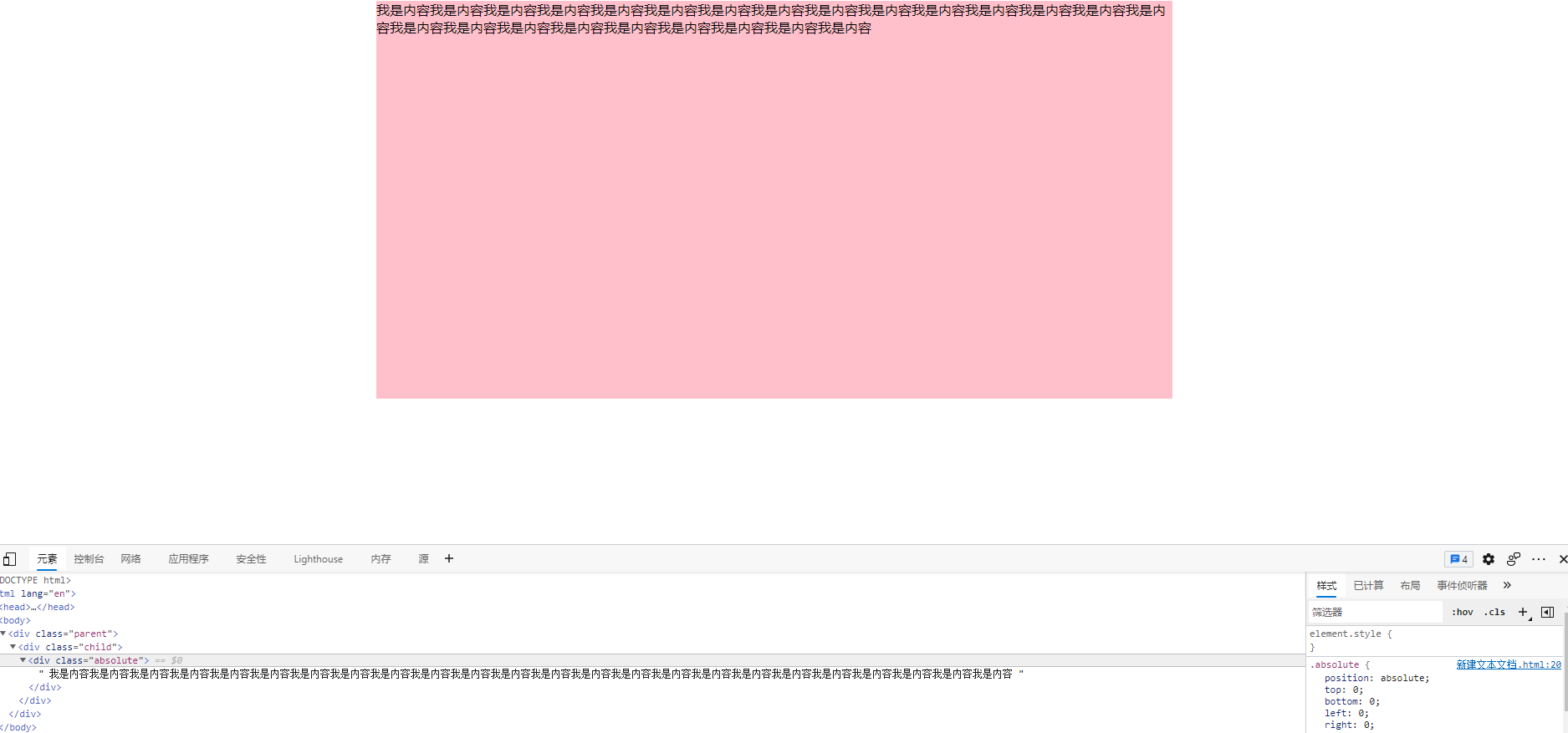
这时.absolute盒子的content就以及可以正常的写内容了,如下:
![]()
最后我们可以封装成一个通用vue组件,供业务使用。
1
2
3
4
5
6
7
8
9
10
11
12
13
14
15
16
17
18
19
20
21
22
23
24
25
26
27
28
29
30
31
32
33
34
35
36
37
38
39
40
41
42
43
44
45
46
47
48
49
50
51
52
53
54
55
56
| <template>
<div class="aspect__ratio__wrapper" :style="{ width }">
<div
class="aspect__ratio__container"
:style="{
'padding-top': getPaddingHeight + '%',
}"
>
<div class="aspect__ratio__absolute">
<slot></slot>
</div>
</div>
</div>
</template>
<script>
export default {
props: {
ratio: {
type: Number,
default: 1,
},
width: {
type: String,
default: '100%',
},
},
computed: {
getPaddingHeight() {
return (1 / this.ratio) * 100
},
},
}
</script>
<style lang="less" scoped>
.aspect__ratio__wrapper {
.aspect__ratio__container {
position: relative;
height: 0;
.aspect__ratio__absolute {
position: absolute;
top: 0;
bottom: 0;
left: 0;
right: 0;
}
}
}
</style>
|