解决嵌套flex布局子容器内容超出父容器
前言
解决嵌套 flex 布局子容器内容超出父容器
正文
flex 布局作为一种新的布局方案,可以说是非常的好用,能够解决大部分的布局问题
相比于传统的 display 、 position 、 float 来说,flex 的学习成本更低
性能方面我不懂,这里贴一个帖子
随着时间的推移,现在基本上主流的 UI 库都使用 flex 布局来构建栅格组件了
激进一点的,比如 naive-ui 使用了 grid 布局
像以前的居中布局,大部分用的 position + transform (子元素宽高可不确定) position + margin (子元素宽高必须确定)
又或者首页的侧边栏固定宽度,中间自适应大小,大部分用基于 float的双飞燕或者圣杯(之前的帖子有写过实现)
记忆这些特殊的布局总是让人恼火
但是 flex 之后,一切都变得简单了
居中?简简单单
1 | <div class="parent"> |
1 | /* 应用于父元素 */ |
如果使用 position + transform 的话
1 | .parent { |
固定一栏 + 自适应一栏?简简单单
1 | <div class="parent"> |
1 | .parent { |
看起来好像没简单多少,但是个人觉得心智负担减少了很多
在使用 flex 作为布局模式的时候,很多情况下需要嵌套的使用
比如如下的布局(网易云播放器的一个 UI)

忽略那个喜欢的按钮
实现这个布局,一般我们使用两层 flex
html 结构如下
1 | <div class="music"> |
css 如下
1 | .music { |
这个时候我们就得到了一个简易版的布局
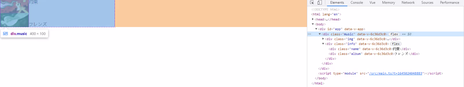
看上去已经没什么问题了
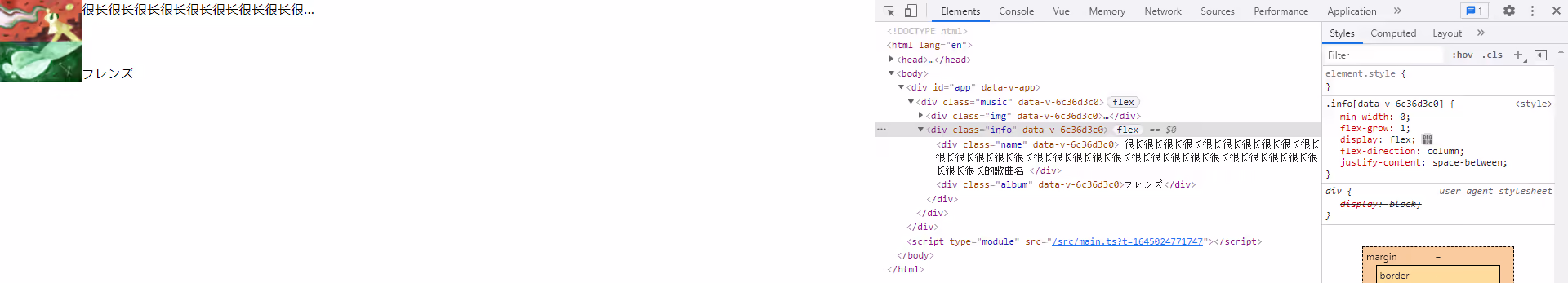
但是如果我们的歌曲名非常的长,长到超出了父元素的宽度(这里指 div.music )
这个时候我们一般会设置为超出部分显示省略号,也就是使用下面的 css
1 | .name { |
那么此时会出现下面的状况
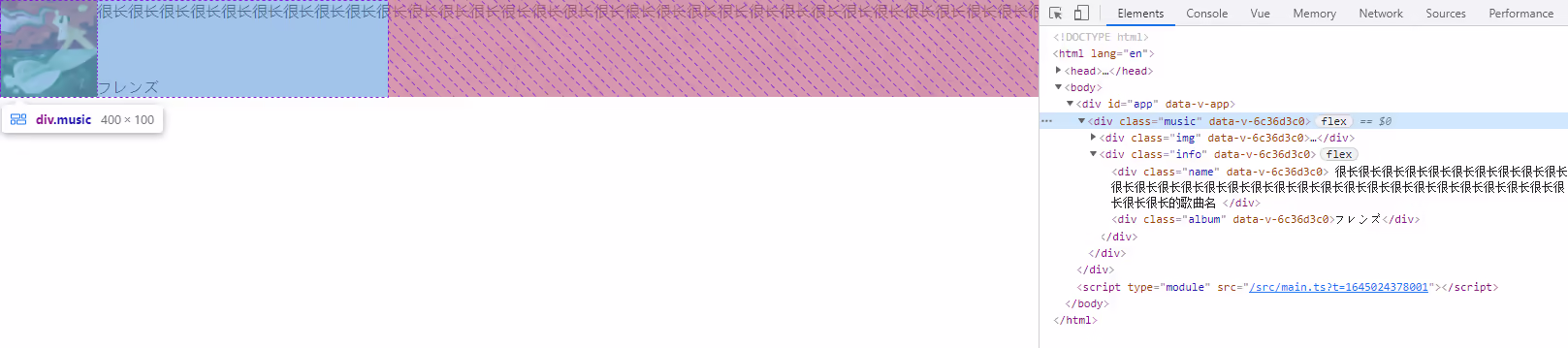
这里 div.music 并没有被撑开,因为我们设置为了 400px

而 div.info 由于子元素被撑开了
按正常思维来说,虽然 div.info 设置了 flex-grow: 1 ,但是它的宽度应该是不能超过 div.music 的
这时,我们就需要在 div.info 加上一个 width: 0 ,或者 min-width: 0 或者 overflow: hidden,效果就会符合逻辑
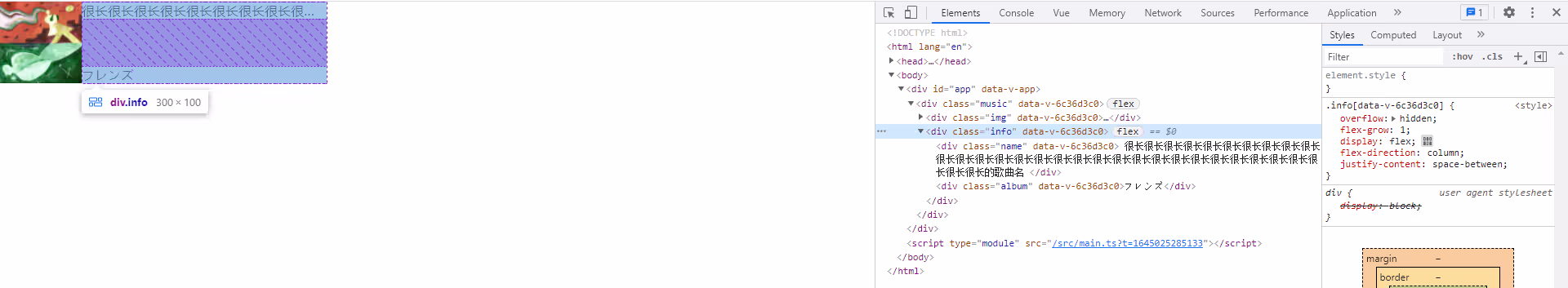
是不是很神奇
这种撑开的现象不只出现在文字不换行上,只要子 flex 的内部的元素的宽度和超过这个父元素的宽度时都会出现
虽然很久前就知道了这个,不过一直它当特性来用
借着这次要写下来,就顺便找了找网上的文章,看看有没有解释原理的
然后我在 css 规范上 flex 一节找到了一些解释
关键点就在 min-width 这个属性上
In general, the content-based minimum size of a flex item is the smaller of its content size suggestion and its specified size suggestion
一般情况下, flex 布局的子元素的最小尺寸是根据该子元素内容的大小和指定的大小的最小值确定的
而 min-width 在 flexItem 下默认情况下的值为 auto
这时候就造成了最小的尺寸等于 flexItem 内容的大小来确定
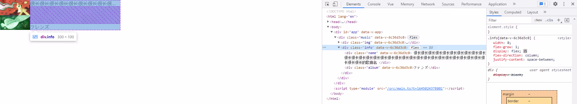
对应到我们的举的例子中, div.info 既是 flex 元素,又是 flexItem
对于 div.music 来说, div.info 的内容由它的子元素大小来确定
这样由于 div.info 过长,所以溢出了 div.music 规定的区域(由于 div.music 设置了固定宽,所以溢出)
而当我们 设置 min-width 或者 width 为 0 时
此时 flexItem 的尺寸最小值就变成指定的大小和内容大小的最小值了
而由于设置的值为 0 ,意味着 flexItem 的最小值为 0
这时候 div.info 的尺寸最小值为 0 ,也就只能占据 div.music 剩余的宽度了( div.info 设置了 flex-grow: 1)
那为什么设置 overflow: hidden 也可以生效呢?
To provide a more reasonable default minimum size for flex items, the used value of a main axis automatic minimum size on a flex item that is not a scroll container is a content-based minimum size; for scroll containers the automatic minimum size is zero, as usual.
没错,规范中指出在默认情况下 flexItem 的最小尺寸为它的内容大小确定
而当 flexItem 成为滚动容器之后,此时 flexItem 的最小尺寸就为 0 了
所以也就能和 min-width: 0 和 width: 0 生成一样的效果了
在下面的注意事项中,我还发现了一个有趣的点
Note also, when content-based sizing is used on an item with large amounts of content, the layout engine must traverse all of this content before finding its minimum size, whereas if the author sets an explicit minimum, this is not necessary. (For items with small amounts of content, however, this traversal is trivial and therefore not a performance concern.)
在使用基于内容大小的最小尺寸下,这意味着引擎必须遍历该 flexItem 的内容才能确定最小值,如果这样的 flexItem 过多,可能就会造成性能问题
而如果我们明确了最小值,那么引擎就不必去遍历内容来知道大小了
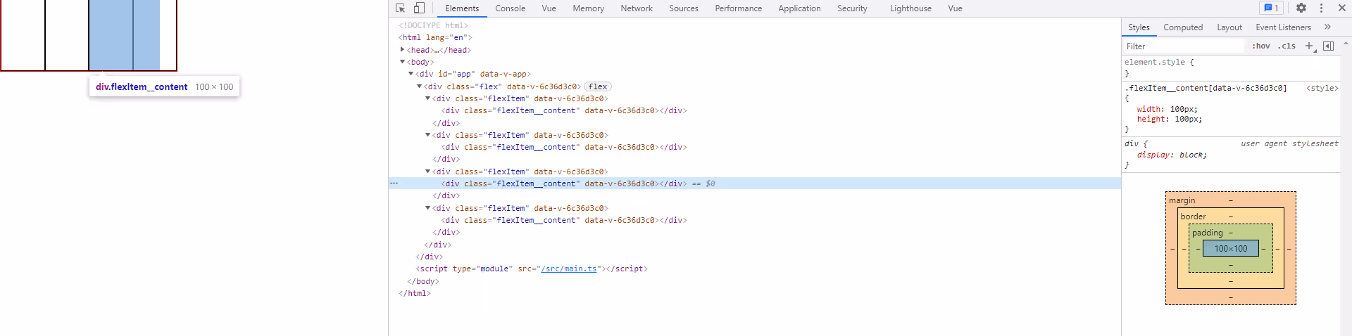
在了解上面之后,其实不必使用嵌套的 flex 也可以复现这个过程
html 如下
1 | <div class="flex"> |
css 如下
1 | .flex { |
效果如下:
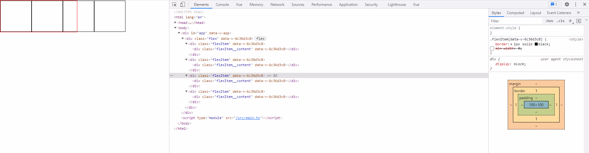
可以看到这里我们设置 flexItem 的内容 div.flexItem__content 为 100px
而此时 flexItem 并没有按默认情况下进行收缩(默认情况下 flex-shrink 为 1)
而当我们设置 min-width: 0 之后, 盒子正确的进行了收缩
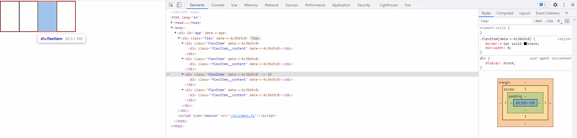
此时 div.flexItem__content 依然为 100px ,但 flexItem 却不会被影响到了