CSS之双飞翼布局和圣杯布局。
这两种布局都是左右固定,中间自适应,也就是占满。
并且兼容性很好,中间部分优先渲染。
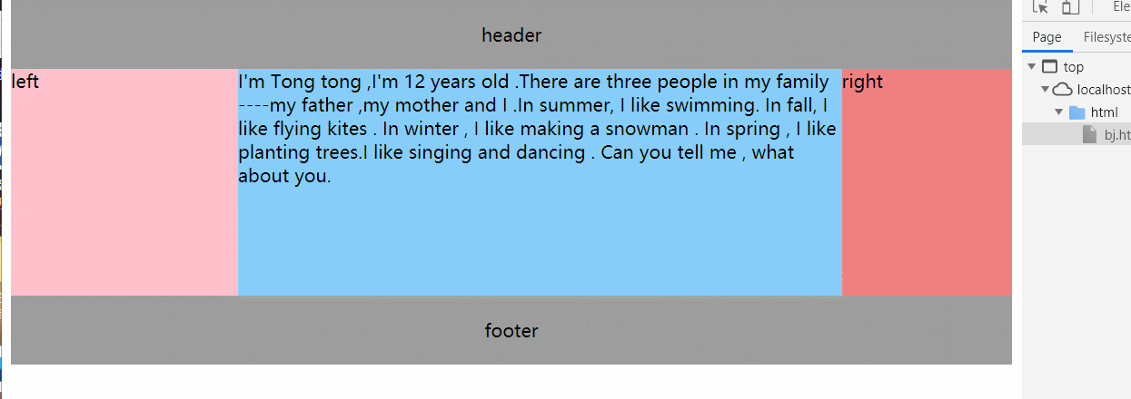
圣杯布局 使用了浮动,负边距以及相对定位
html:
1 2 3 4 5 6 7 8 9 <body > <header > header</header > <main > <section id ="center" class ="col" > center</section > <section id ="left" class ="col" > left</section > <section id ="right" class ="col" > right</section > </main > <footer > footer</footer > </body >
css:
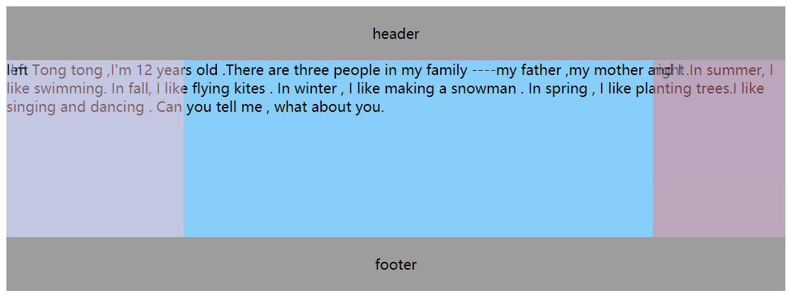
1
2
3
4
5
6
7
8
9
10
11
12
13
14
15
16
17
18
19
20
21
22
23
24
25
26
27
28
29
30
31
32
33
34
35
36
37
38
39
40
41
header ,footer { padding : 20px 0 ; text-align : center; background-color : #9d9d9d ; } main { padding-left : 200px ; padding-right : 150px ; } .col { float : left; height : 200px ; } #left { width : 200px ; background-color : pink; margin-left : -100% ; position : relative; right : 200px ; } #right { width : 150px ; background-color : lightcoral; margin-left : -150px ; position : relative; right : -150px ; } #center { width : 100% ; background-color : lightskyblue; } footer { clear : both; }
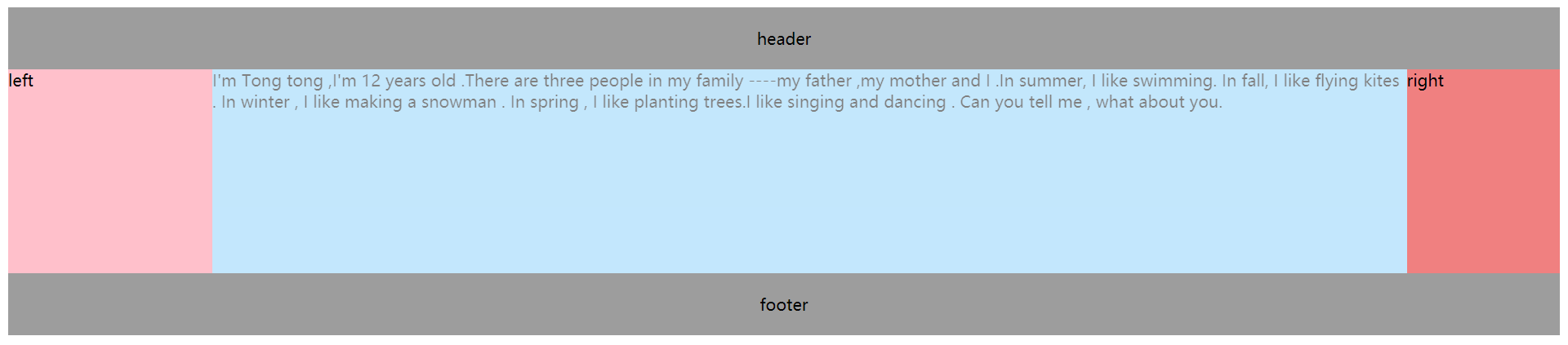
效果图:
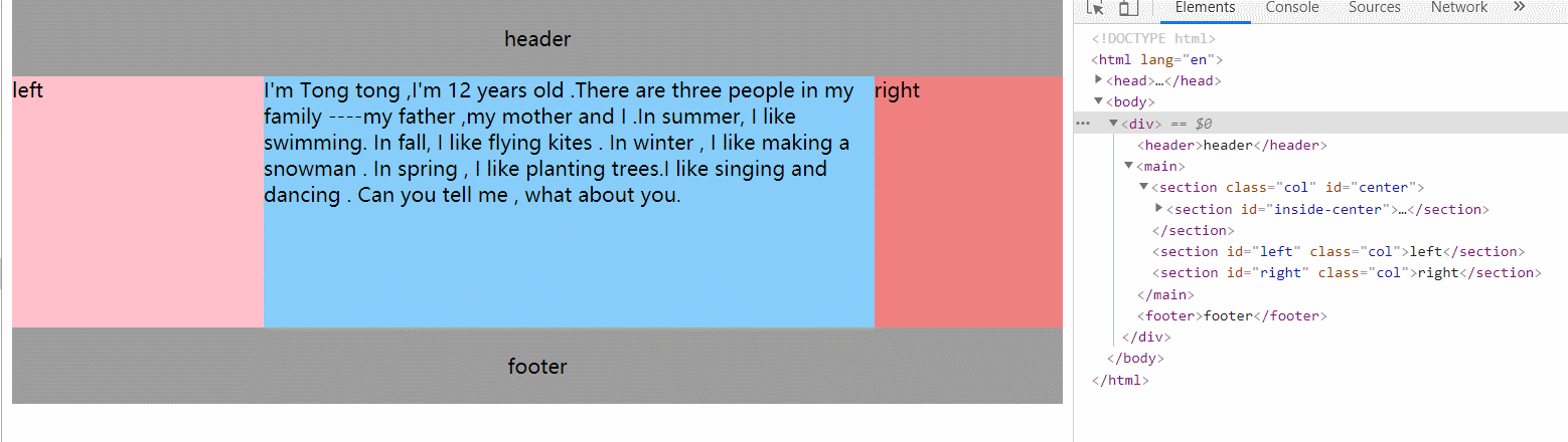
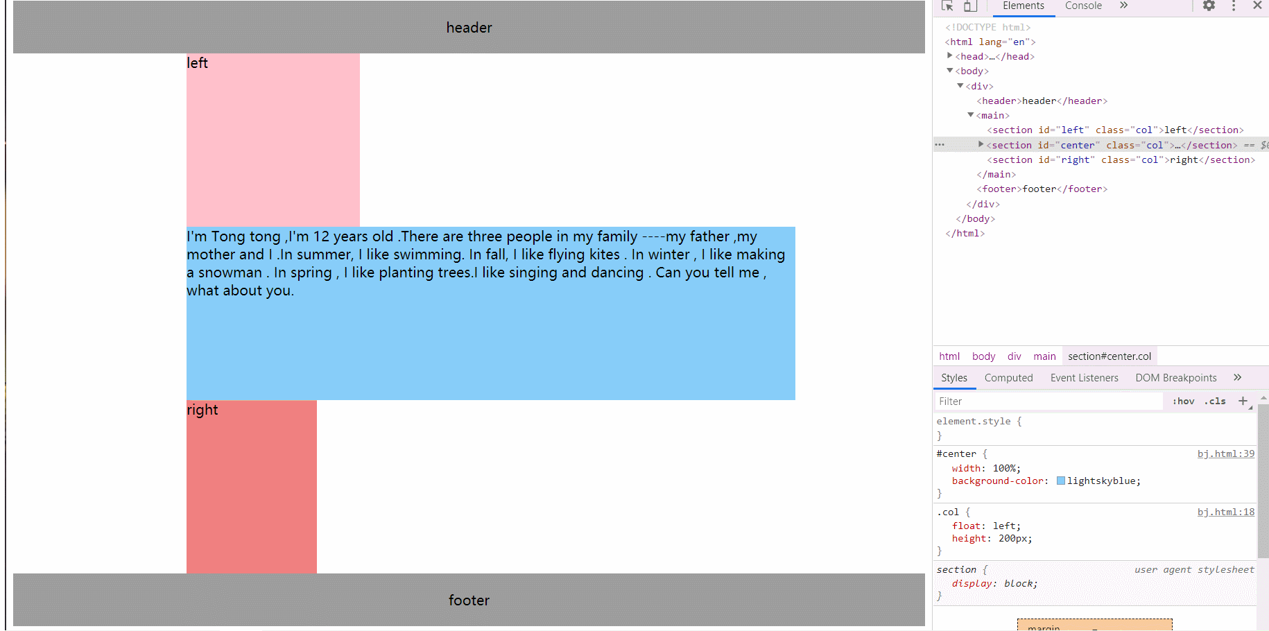
双飞翼布局 html:
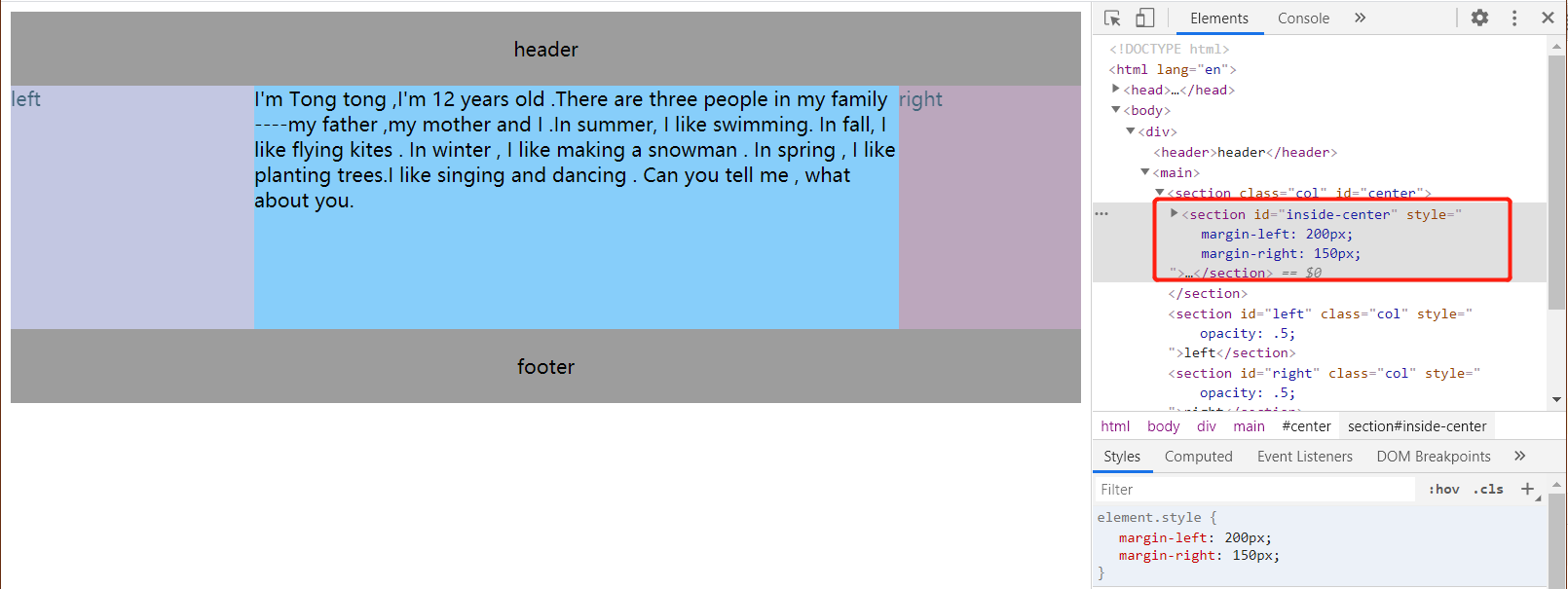
1 2 3 4 5 6 7 8 9 10 11 12 13 14 15 16 <body > <header > header</header > <main > <section class ="col" id ="center" > <section id ="inside-center" > I'm Tong tong ,I'm 12 years old .There are three people in my family ----my father ,my mother and I .In summer, I like swimming. In fall, I like flying kites . In winter , I like making a snowman . In spring , I like planting trees.I like singing and dancing . Can you tell me , what about you. </section > </section > <section id ="left" class ="col" > left</section > <section id ="right" class ="col" > right</section > </main > <footer > footer</footer > </body >
css:
1
2
3
4
5
6
7
8
9
10
11
12
13
14
15
16
17
18
19
20
21
22
23
24
25
26
27
28
29
30
31
32
33
34
35
36
37
header ,footer { text-align : center; padding : 20px 0 ; background-color : #9d9d9d ; } .col { float : left; height : 200px ; } #left { width : 200px ; background-color : pink; margin-left : -100% ; } #right { width : 150px ; background-color : lightcoral; margin-left : -150px ; } #center { width : 100% ; background-color : lightskyblue; } #inside-center { margin-left : 200px ; margin-right : 150px ; } footer { clear : both; }
效果图:
区别 从上面可以看出,圣杯和双飞翼的布局的主要区别在:
如何腾出中间栏左右的位置来来适应左右栏的宽度?
圣杯布局中,使用了相对定位和左右padding来实现。
我们对整个包裹中间的main使用了padding,使得这个盒子的content-box的宽度变小。
在里面的center列使用了100%宽度来占满整行,使得另外两行都被放到了下一行的位置。
上图可以看出左右两边的留白就是给main设定padding的效果。
而由于我们是先写center列再写left列和right列的,所以100%宽度的center占满第一行 。
左右定长的列left列和right列便依次放在第二行 。
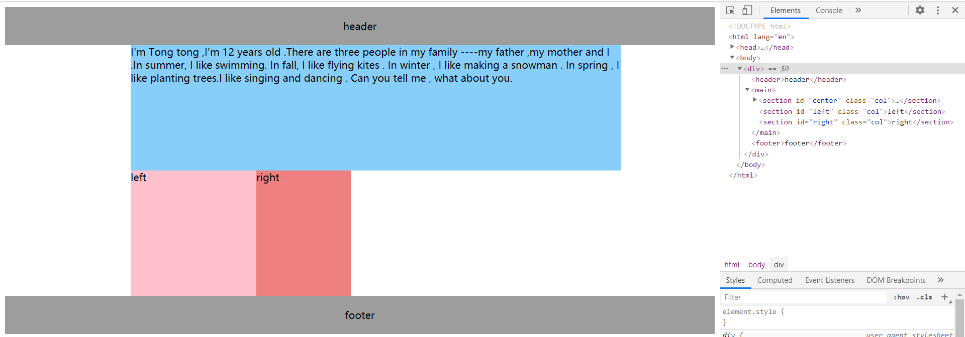
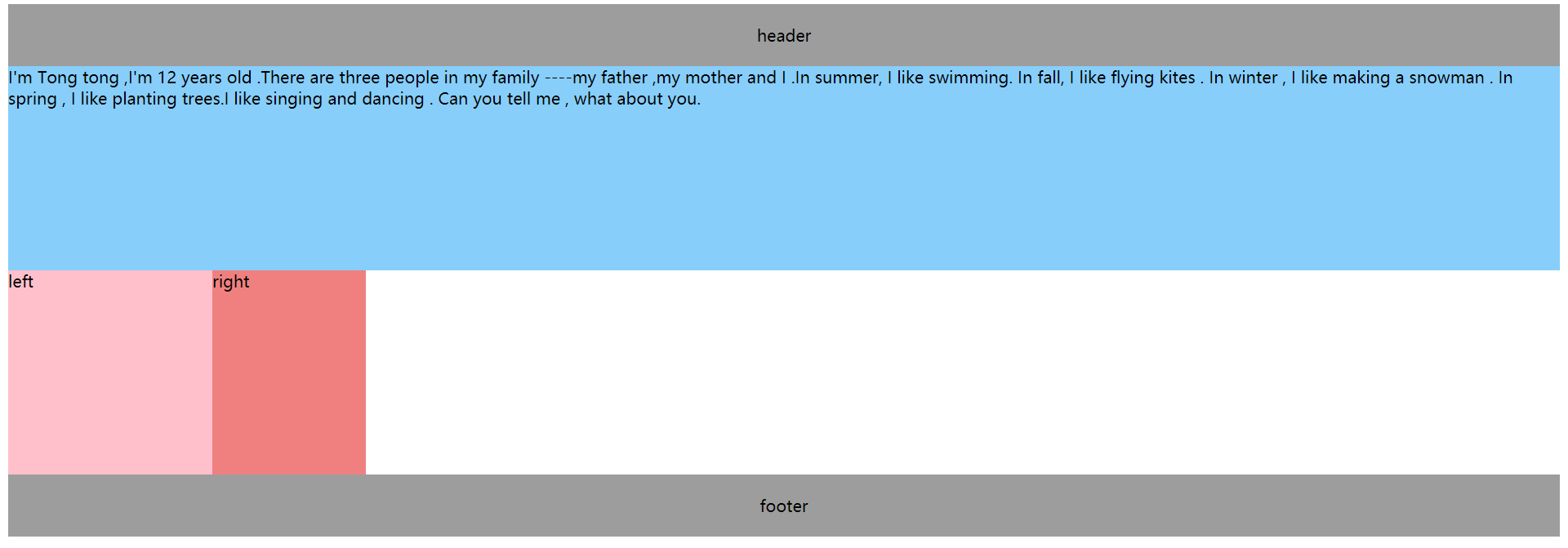
如果现在把先写left列再写center列和right列的话,就会是下面这种情况:
但是即使这样我们也可以实现圣杯布局。
怎么做呢?其实想法是差不多的。
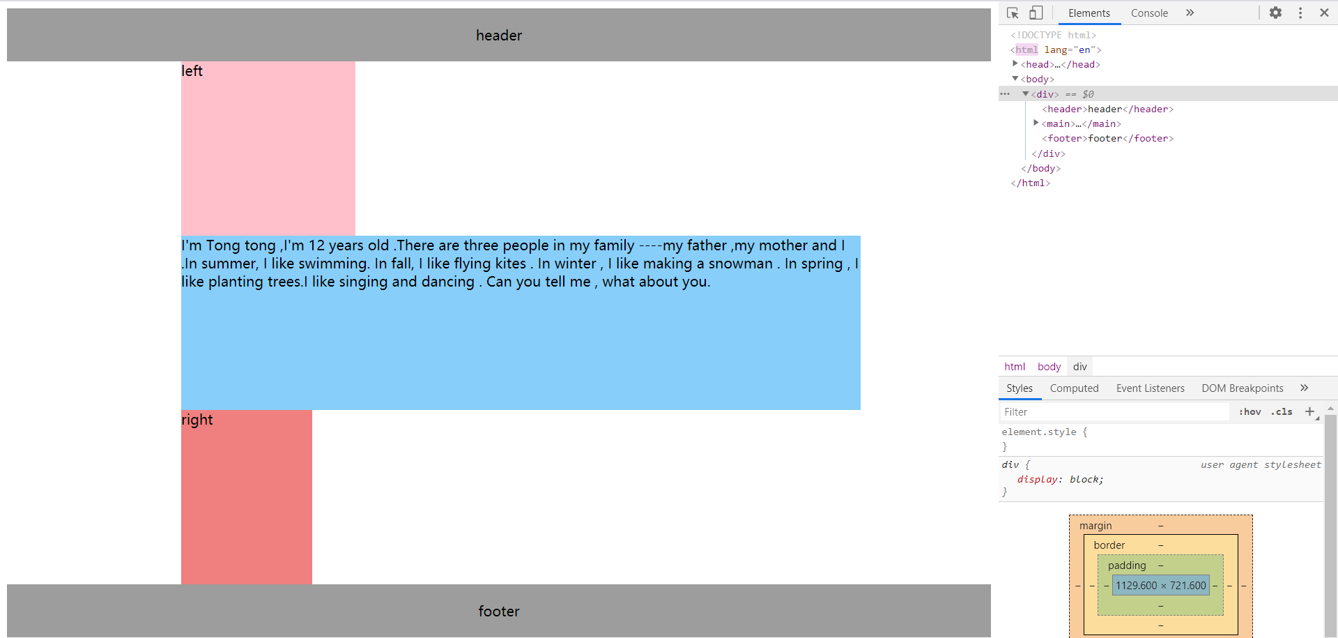
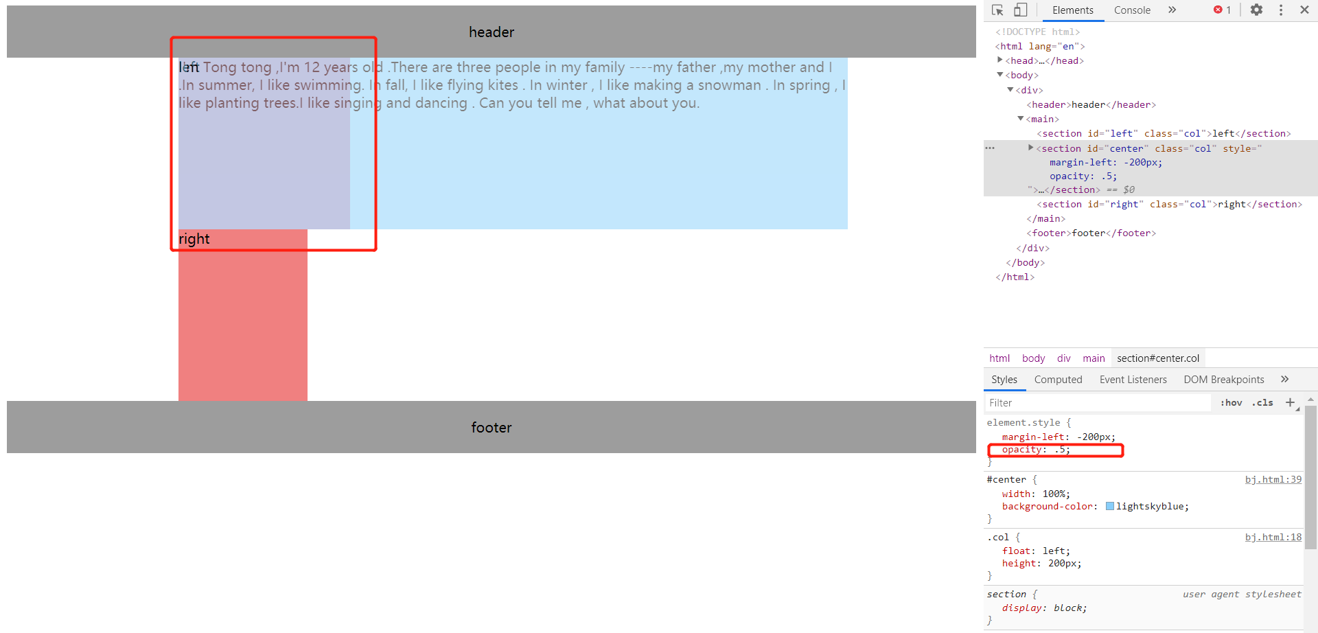
第一步,我们先把center行拉到第一行来,使用左负边距,值为负的左列的宽度。
这时候我们发现left列不见了,其实不然,他只是在center列的下面而已。
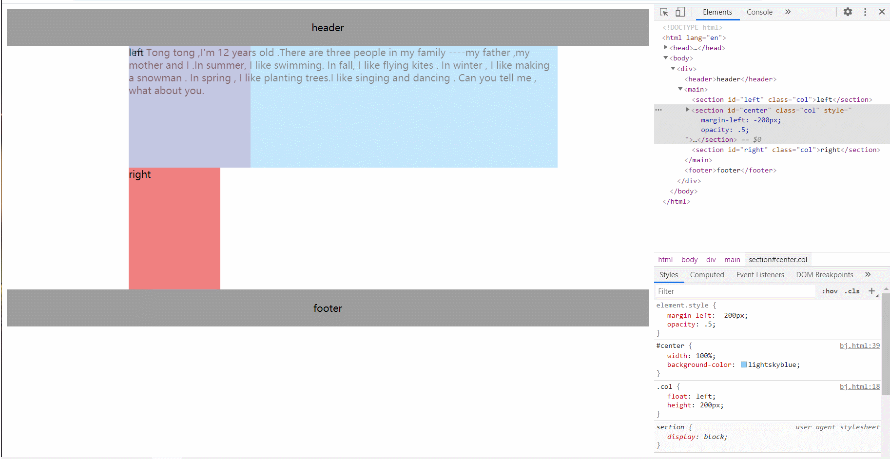
接下来,我们要把right列也给拉到第一行来,使用做负边距,值为负的右列的宽度。
现在我们已经完成了90%的工作,剩下的就是把左右两列拉到padding出来的位置上。
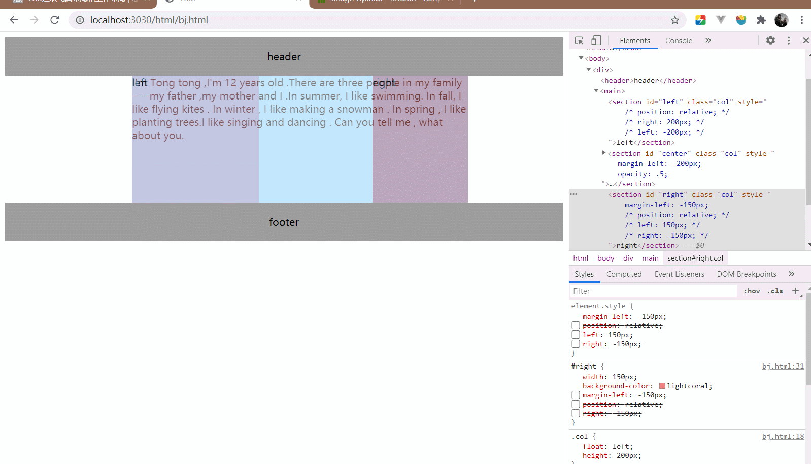
使用相对定位,定位左右两列盒子:
完成效果如下(动图好像录制不了太长,晕…):
ok回到前面,我们为什么要先写center列再写left列和right列呢?
答案就是我们希望中间的列先渲染出来。
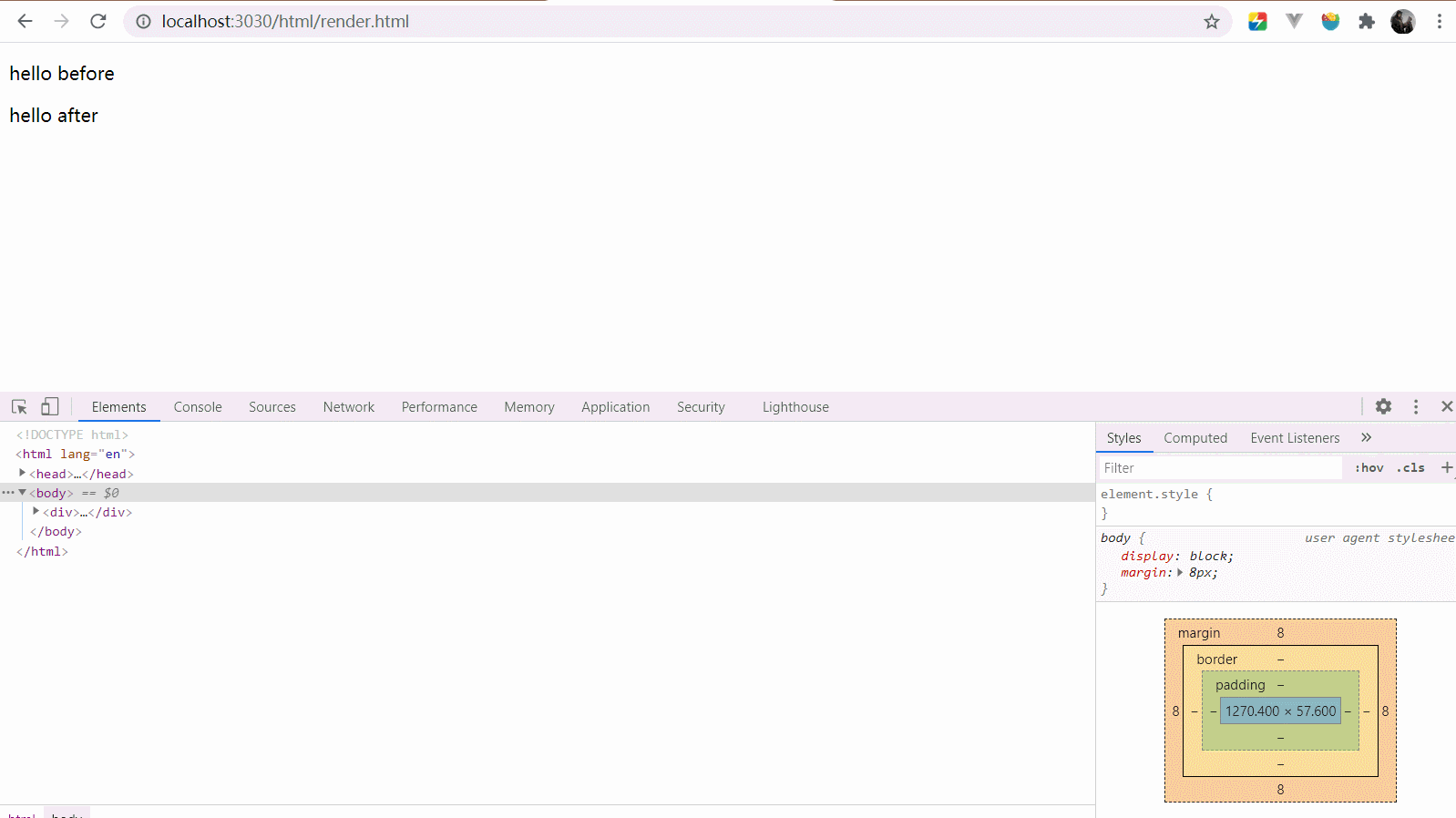
渲染树的渲染(DOM树,也就是HTML的节点树 + CSSOM 树,css样式形成的树)类似DFS深度优先遍历。
我们可以用debugger断点,来强制阻塞当前的渲染。
1 2 3 4 5 6 7 8 9 10 11 <div > <div > <p > hello before</p > </div > <script > debugger </script > <div > <p > hello after</p > </div > </div >
从图来看确实是这么回事,解析渲染树
但是遇到了内联的 js 代码,停下来执行了 js 代码,执行完毕继续解析
这里可以看下面这篇文章,我觉得相当不错
浏览器是如何解析 html 的?
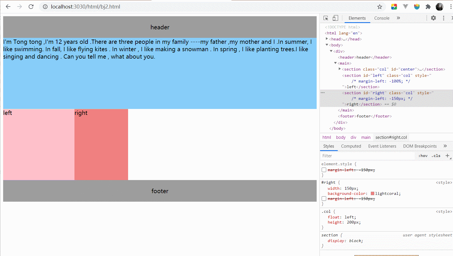
ok,写完了圣杯布局,来看看双飞翼是如何实现的
对于如何腾出中间栏左右的位置来来适应左右栏的宽度?
双飞翼布局使用了在center列增加一个内部的盒子。
使用margin-left和margin-right正数值来实现。
在三列只设定浮动的情况下,会是下面这个样子。
到此为止,看出和圣杯布局的差别了没有,没错,就是少了main盒子的padding而已。
接下来的事情和圣杯布局是一样的,我们要把left列拉到第一行,放到最左侧。
把right列拉到第一行,放到最右侧,使用负边距来实现。
ok 现在我们已经把三个列都放到一行了,但有个问题没有解决,就是center列的左右被挡住了。
没错,双飞翼解决的办法就是在center列中增加一个盒子。
指定这个在内部盒子的margin-left和margin-right来腾出左右的地方。
ok,这两种布局基本上就是这样子了,我还是喜欢圣杯布局的,毕竟少一个内部的盒子嘛~
最后 其实这两种布局都基于负边距margin和相对定位来实现
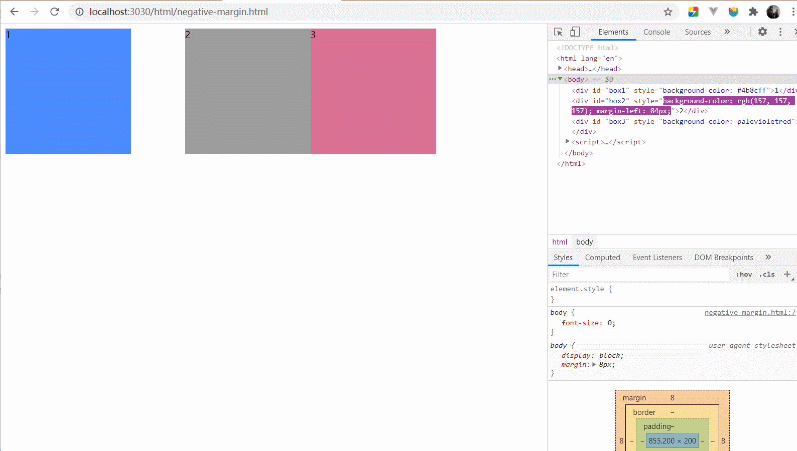
负边距margin 会使得盒子重叠,我的理解比较的简单,正的边距表示我应该离你“远一点”。
那么负边距意味着我应该离你“近一点”,即使我和你会重叠。
注意,负边距是会改变盒子的真正位置的,这和相对定位不同。
比如下面的gif,可能可以帮你理解负的margin。
1 2 3 <div id ="box1" style ="background-color: #4b8cff" > 1</div > <div id ="box2" style ="background-color: #9d9d9d" > 2</div > <div id ="box3" style ="background-color: #db7093" > 3</div >
1
2
3
4
5
6
7
8
9
body { font-size : 0 ; } div { display : inline-block; font-size : 14px ; width : 200px ; height : 200px ; }
1 2 3 4 5 6 7 8 9 10 11 12 let dir = 1 let step = 0 setInterval (() => { document .getElementById ('box2' ).style .setProperty ('margin-left' , step + 'px' ) if (step === 200 ) { dir = -1 } else if (step === -200 ) { dir = 1 } step += dir }, 16 )
效果图:
可以看出,我们控制的盒子2的样式,但是盒子3和盒子2一起运动。
也就是说盒子2在文档流的位置是不断变化的。
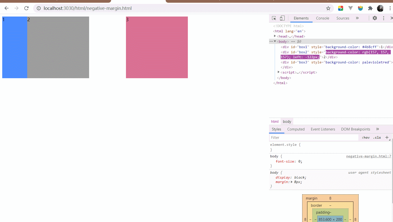
相对定位position: relative 相对定位可以让盒子基于文档流的位置以自身位置进行偏移。
但是文档流的位置是不会改变的(也就是元素还是会占据没相对定位前的位置,下面的动图可以看出)。
还是用负边距margin的例子,改下css。
1
2
3
4
5
6
7
8
9
10
11
12
body { font-size : 0 ; } div { display : inline-block; font-size : 14px ; width : 200px ; height : 200px ; position : relative; }
1
2
3
4
5
6
7
8
9
10
11
12
let dir = 1 let step = 0 setInterval (() => { document .getElementById ('box2' ).style .setProperty ('left' , step + 'px' ) if (step === 200 ) { dir = -1 } else if (step === -200 ) { dir = 1 } step += dir }, 16 )
效果图:
不管移动到哪里,原来的位置就是盒子2在文档流的位置,相对定位的盒子移动不会影响到其他的盒子。